5 keywords that describe ATHENA’s identity:
- Dynamic
- Bright
- Contemporary
- Inclusive
- Simple
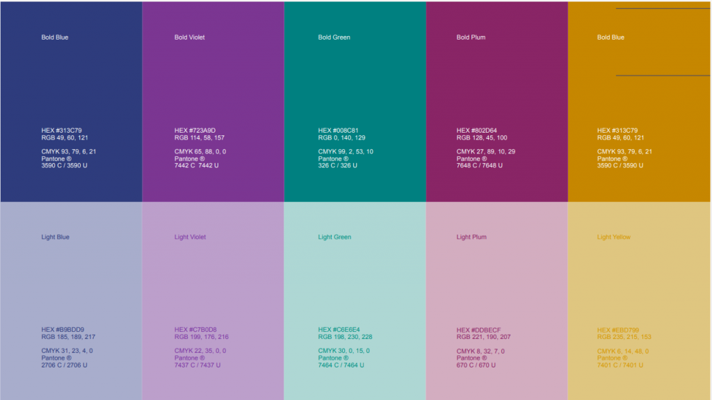
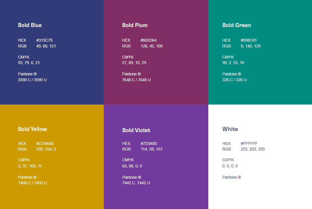
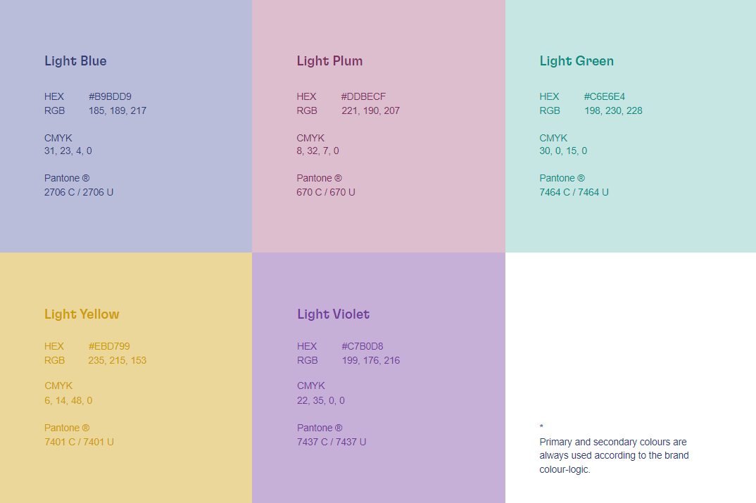
Dark blue is the main brand colour. It is one of the means to convey Athena’s reliability. Additional colours bring brightness and softness to the Athena’s visual identity. It is a tool that provides means to create dynamic and contemporary applications. It also enables the brand to convey its creator and caregiver archetypes.
Download the leaflet of ATHENA European University.
Primary colours are the key colours that establish brand identity. They are used in both printed and digital materials. Dark blue is the dominant brand colour, conveying ATHENA’s reliability; it should be used mainly for official applications such as stand-alone logos, documents, and letterheads. In adherence to the brand visual identity guidelines, primary colours can be used as accents combined with secondary colours.
ATHENA European University alliance is co-funded by the Erasmus+ Programme of the European Union.
When referring to ATHENA, please use the following disclaimer and logo. ATHENA European University alliance is co-funded by the Erasmus+ Programme of the European Union.